Image Accordion element for Bricks Builder is used to display multiple images in an accordion style. With multiple styling options, you can customize this element fully as per your design requirements.
You can check out the demo of Image Accordion Element.
To start using the element, edit your page using Bricks. Now search for Image Accordion and drag and drop it to a desired position on the page.
Image Accordion element has all the options in the Content tab and the options are arranged in the following sections:
- Accordions
- Settings
- Accordion Items
- Accordion Content
- Accoridon Button Style
Let's go through each section in detail.
Accordions#
This section has repeater control to add any number of items to your Image Accordion element.
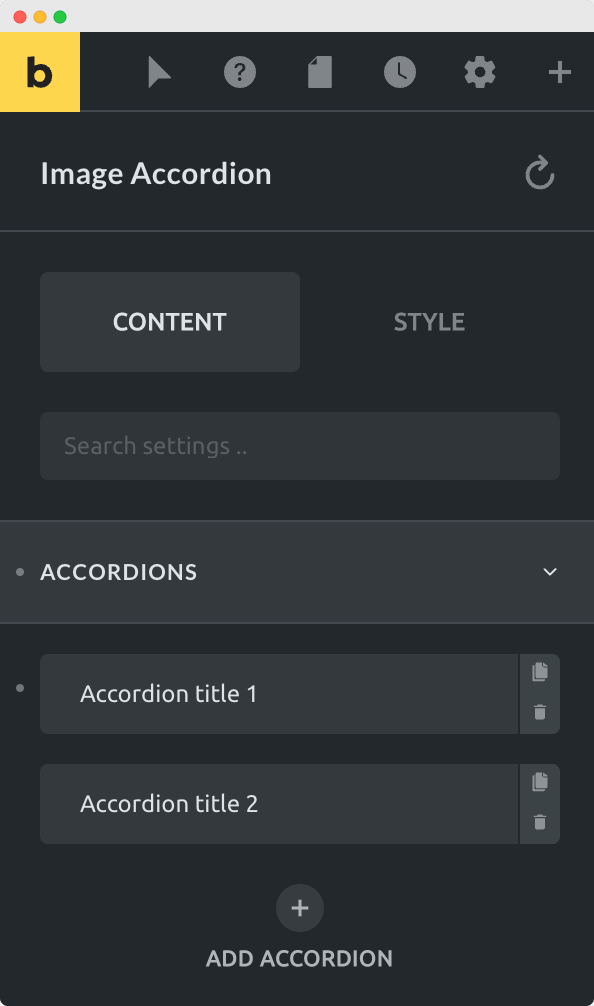
For each item, you can add:
- Title - Title for the accordion.
- Content - Small description for the accordion.
- Image - The main part of the image accordion. Title and content are shown above this image.
- Button - Button can be shown with or without adding the link.
Settings#
This section has all the options required to control the layout and structure of the image accordion.
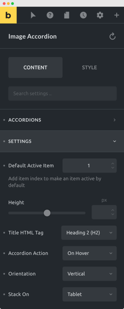
Here are the options available in the Settings section:
- Default Active Item - You can add the index or number of item here that you want to make active by default. Suppose you want the 2nd item to open by default on page load, then you can enter "2" in this field.
- Height - With height option, you can increase or decrease the height of image accordion.
- Title HTML Tag - This option allows you to change the HTML tag of title. For SEO purpose, you can choose any heading type that you want for your title.
- Accordion Action - With Accordion Action, you can choose to show an item by hovering your mouse over it or with mouse click action.
- Orientation - Change the orientation to vertical or horizontal.
- Stack On - You can choose to stack the items on tablet or mobile or never stack them on any device.
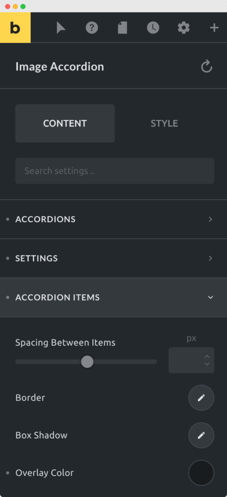
Accordion Items#
This section is to style the container of accordion items. Styling options like border, box-shadow, and overlay color can be changed here. An option is also available to control the spacing or gap between the items.
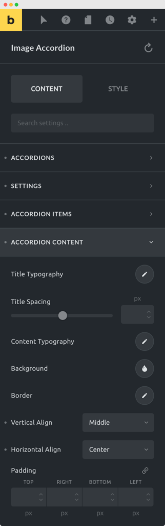
Accordion Content#
In this section, you can find all the options to style the content part. The content part contains the title and description for the image accordion. Here you can change typography, spacing, background, border, and few other style options for the content.
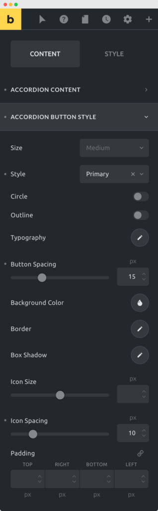
Accordion Button Style#
If you are showing a button in the accordion then you can make changes to the styling of the button here. You can change the size of the button, make changes to the background and border. You can also change typography, spacing among few other styling options.