Max Addons Album Element for Bricks Builder helps you create beautiful image albums with customizable cover images, buttons, captions, and lightbox functionality.
With support for custom triggers, cover content, and multiple lightbox libraries, you can fully control how users interact with your image albums.
Getting Started#
Before using the Album Element, make sure the following tools are installed and activated on your WordPress website:
Once both tools are active, you’re ready to start using the Album Element on your page.
How to Add the Album Element#
Follow these steps to add the Album Element to your page:
- Open an existing page in Bricks Builder or create a new page.
- Click Edit with Bricks to launch the builder.
- Inside the editor, click the element search bar.
- Type "Album" in the search field.
- Add the Album Element to your page.
- Make sure you see the MAX label in the top-left corner of the element.
Once the element is added, you’ll see two main tabs:
- Content
- Style
Content Tab#
Content tab includes all the main settings required to create and customize your album. Inside the Content tab, you’ll find the following sections:
- Album
- Trigger
- Cover Content
- Lightbox
Let’s explore each section in detail.
Album#
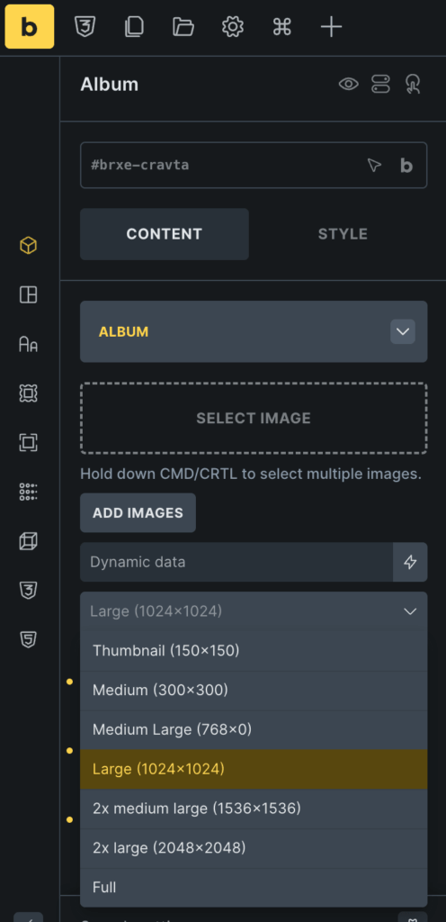
Album section allows you to add and manage album images.
- Select Image: Use this option to upload or select multiple images from your WordPress media library.
- Size: The Size option controls which image size is loaded in the album. Choose different image sizes depending on your layout and performance needs.
Trigger#
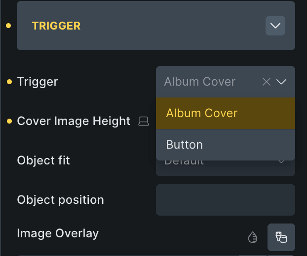
Trigger section lets you decide how users will open the album lightbox.
- Trigger Options: You can choose between: Album Cover or Button
Trigger: Album Cover#
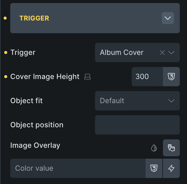
When you choose Album Cover, the album opens when users click on the cover image.
Additional settings become available:
- Cover Image Height: This option controls the height of the album cover image.
- Image Overlay: Enable or customize overlay styling on the cover image.
Trigger: Button#
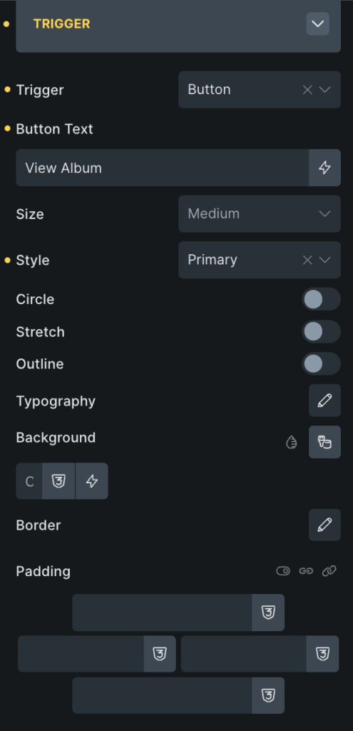
When you choose Button as the trigger type, the album opens when users click a button rather than the cover image.
Several button customization options become available.
- Button Text: Add custom text to your trigger button.
- Size: Control the button size to match your website design.
- Style: Choose different button styles based on your design preferences.
- Enable Circle: Enable this option to create a circular button style.
- Enable Stretch: Stretch the button width across the available space.
- Enable Outline: Display the button with an outline rather than a solid background.
- Typography: Customize the button typography settings, including: Font family, Font size, Font weight, and more.
- Background: Customize the button background colors and hover effects.
- Border: Control button border styling
- Padding: Adjust spacing inside the button for better sizing and readability.
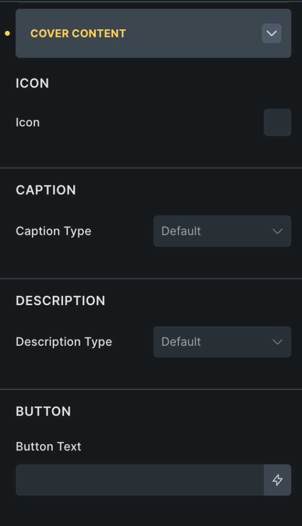
Cover Content#
Cover Content section lets you display additional information above the album cover. This section is available when the Trigger type is set to Album Cover.
You can add icons, titles, captions, descriptions, and custom content to make the album more interactive and informative.
- Icon: Add an icon to the album cover. You can also customize icon typography and styling.
- Caption Type: Choose what content should appear as the album caption. Available options include: Title, Caption, Description, and Custom.
- Description Type: Select what content should appear in the description area. Available options: Title, Caption, Description, Custom
- Button Text: Add custom text for the cover content button.
- Content Styling Options: The Content section also includes styling controls for better layout customization.
Lightbox#
Lightbox section controls how album images open and display in popup view. The Album Element supports two lightbox libraries: Bricks and Fancybox.
Both libraries provide different viewing experiences and customization options.
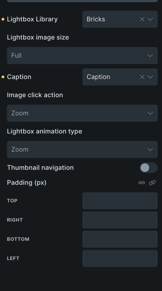
Bricks Lightbox#
Bricks Lightbox uses the native Bricks Builder lightbox functionality. Additional options become available when using Bricks Lightbox.
| Option | Description |
|---|---|
| Image Click Action | Control how images behave when clicked. |
| Lightbox Animation Type | Choose animation styles for opening and closing the lightbox. |
| Thumbnail Navigation | Enable thumbnail navigation inside the lightbox. |
| Padding | Adjust spacing inside the lightbox layout. |
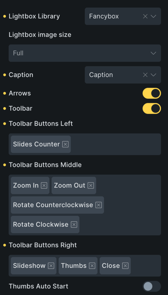
Fancybox Lightbox#
Fancybox provides additional advanced lightbox controls and a modern gallery experience. When Fancybox is selected, more customization options become available.
| Options | Description |
|---|---|
| Enable Arrows | Show next and previous navigation arrows inside the lightbox. |
| Enable Toolbar | Display a toolbar inside the lightbox for additional controls. Once enabled, you can customize: Toolbar Buttons Left, Toolbar Buttons Middle, Toolbar Buttons Right. |
| Thumbs Type | Choose the thumbnail preview style for the gallery. Available options: Classic or Modern |
| Lightbox Image Size | Control which image size loads inside the lightbox. |
| Caption Options | Choose which content should appear as the lightbox caption. Available options: Title, Description, or Caption |
Wrapping Up!#
Album Element for Bricks Builder makes it easy to create interactive, visually engaging image albums directly in the Bricks Builder editor.
With flexible trigger options, customizable cover content, and advanced lightbox settings, you can build professional-looking galleries without using additional plugins or custom code.