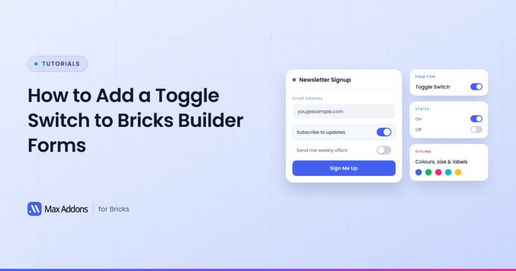
Looking for a better way to add On/Off choices to your Bricks Builder forms?
A traditional checkbox works well for simple selections. Still, when you want visitors to clearly understand whether an option is enabled or disabled, a toggle switch can provide a more intuitive and modern experience.
With the Toggle Switch Form Field for Bricks Builder from Max Addons, you can easily add an interactive On/Off switch to your forms and customize its behavior, appearance, submitted value, and default state.
In this guide, we’ll show you how to add a Toggle Switch Field to your Bricks Builder forms, explain each available setting, and walk through a practical newsletter signup example.
Why Use a Toggle Switch in Your Bricks Builder Forms?
A traditional checkbox can sometimes make a user’s choice unclear. An unchecked checkbox could mean “No,” “Not selected,” or “I haven’t chosen this yet.” This ambiguity can make it harder for visitors to understand the current state of an option.
A toggle switch makes the state much more explicit. It visually communicates whether an option is On/Off or Enabled/Disabled, making it a better choice for settings and preferences with two clear states.
For example, instead of asking visitors to check a box to subscribe to a newsletter, you can use a toggle labeled “Subscribe to our newsletter.” Visitors can instantly see whether the option is enabled or disabled.
When a Toggle Switch Makes Sense
Not every form field should be a toggle. It’s built specifically for situations where the visitor either opts in or doesn’t. Some of the most common use cases include:
- Accepting terms and conditions
- Newsletter subscriptions
- Email notification preferences
- Marketing preferences
- Optional services
- Feature selections
A newsletter signup is the clearest example.
Rather than a small checkbox with the text “Subscribe to our newsletter” next to it, you add a toggle switch with that same label.
The visitor slides it on, and your form submits a clear, identifiable value confirming their choice. It’s a small change, but it noticeably improves how the option reads on the page.
Before You Begin
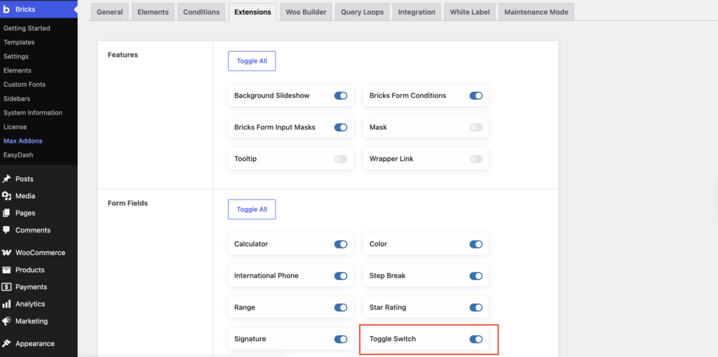
Before adding the Toggle Switch Field to your form, make sure the required Max Addons extension is enabled. Go to: WordPress Dashboard >> Bricks >> Max Addons >> Extensions.
Enable the Form Fields extension and the Toggle Switch Field, then save your changes. Once enabled, you can add the Toggle Switch Field directly from the Bricks Form element.
How to Add a Toggle Switch Field to Bricks Builder Forms
Adding the Toggle Switch Field to your form only takes a few steps.
Step 1: Open Your Page in Bricks Builder
Open the page where you want to add the form and launch it in Bricks Builder. You can either create a new page or edit an existing one.

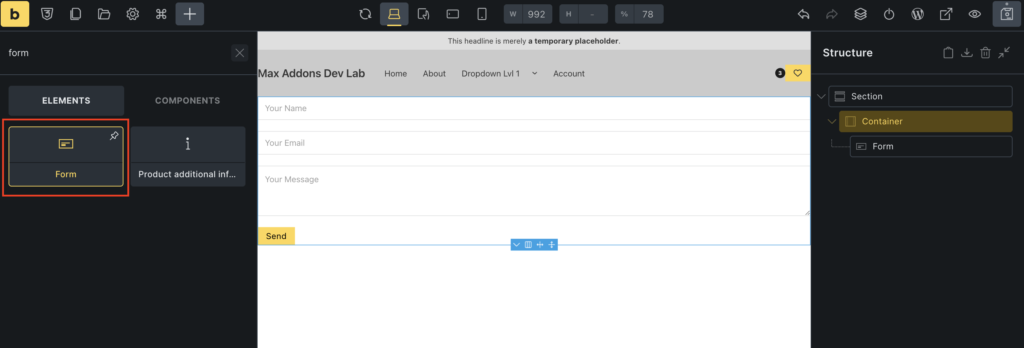
Step 2: Add the Form Element
Next, add the Form element to your page. If you’re working with an existing form, select the Form element to open its settings.
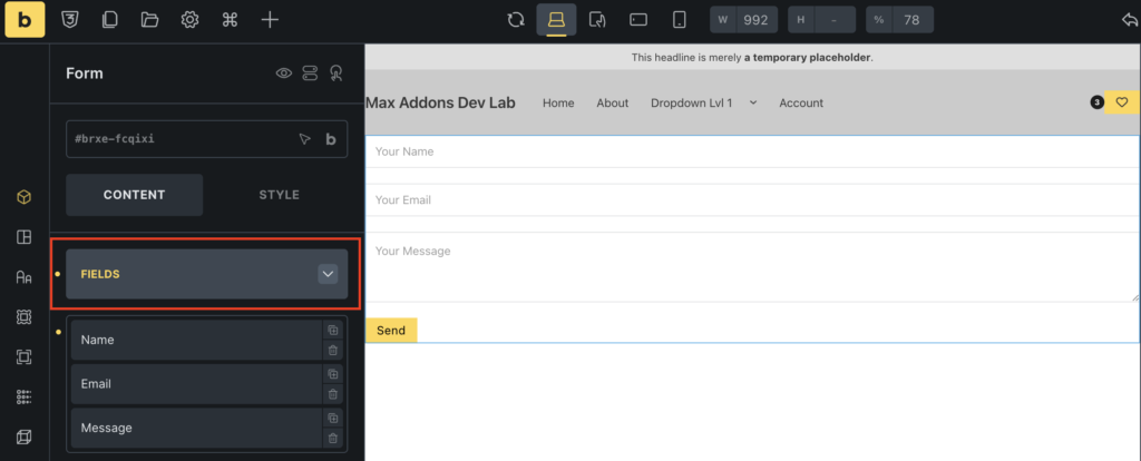
Step 3: Open the Fields Section
In the Form element settings, find the Fields section. This section lets you add and configure the individual fields visitors will interact with.
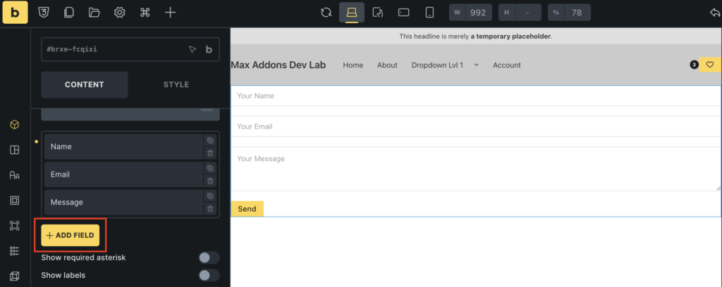
Step 4: Add a New Field
Click + Add Field to add a new field to your form.
Step 5: Select Toggle Switch
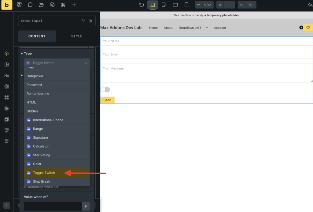
Open the Type dropdown and select: Toggle Switch [Max Addons]
The Toggle Switch will now be added to your form. You can then customize its label, field name, required status, submitted value, default state, color, and width.
How to Configure the Toggle Switch Field
Once you’ve added the Toggle Switch Field, you can configure it according to your requirements. Let’s look at each setting in detail.
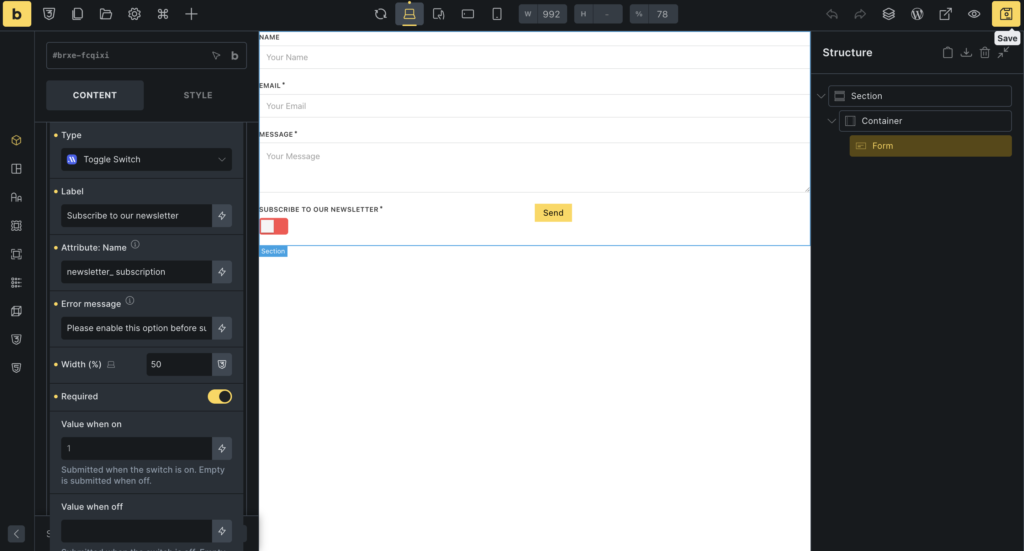
Add a Label
Use the Label setting to describe what the toggle controls.
The label is the text visitors see next to the switch, and it handles much of the communication. Because there’s no checkbox text to lean on for context, your label needs to make the “on” state obvious on its own. Something like:
- Subscribe to our newsletter
- Enable email notifications
For example, “Subscribe to our newsletter” is much clearer than simply “Newsletter” because visitors immediately understand what enabling the option means.
Set the Attribute Name
Use Attribute: Name to assign a unique name to the field.
For example: newsletter_subscription
A descriptive field name makes the submitted form data easier to identify and work with.
Instead of using a generic name such as toggle1, use a name like newsletter_subscription to clearly indicate what the field represents.
Customize the Error Message
If you’ve made the Toggle Switch required, you can use the Error Message setting to control what visitors see if they try to submit the form without turning the switch on. A vague message like “This field is required” doesn’t tell anyone what to do. Something more direct works better
For example: Please enable this option before submitting the form.
Adjust the Field Width
Use Width (%) to control how much horizontal space the Toggle Switch occupies within your form. This is particularly useful when you’re working with multi-column layouts or want to align the toggle with other form fields.
Adjust the width according to your form design.
Make the Toggle Required
Enable Required when visitors must turn the switch on before submitting the form. This can be useful for required acknowledgments or other choices that users must actively confirm.
For example: I confirm that I have reviewed the information above.
You can make this Toggle Switch required if users must actively acknowledge the statement before submitting the form.
Tip: Only make a toggle required when enabling it is genuinely necessary. Optional preferences shouldn’t usually be forced on visitors.
Define the Value When On
The Value When On setting lets you define the value submitted when the Toggle Switch is enabled. For example: Subscribed
When the visitor turns the switch on, the form submits the configured value.
Using a meaningful value can make your submitted form data easier to understand and help when connecting your form to other workflows or email marketing tools.
Turn the Switch On by Default
Enable On by Default so the Toggle Switch starts in the On state when the form loads. Use this option when the setting should be enabled by default.
If visitors should actively choose whether to enable an option, it’s better to leave this setting disabled.
Customize the On Color
Use On Color to customize the color displayed when the Toggle Switch is enabled.
Choose a color that matches your website’s branding and provides enough contrast to make the active state easy to recognize. For example, you could use your website’s primary brand color for the enabled state.
How to Create a Newsletter Signup Toggle
Let’s put everything together with a practical example. Suppose you’re creating a newsletter sign-up form and want visitors to actively choose whether to subscribe.
Add a Toggle Switch Field and configure it as follows:
| Setting | Example |
|---|---|
| Label | Subscribe to our newsletter |
| Attribute: Name | newsletter_subscription |
| Required | Disabled |
| Value When On | Subscribed |
| On by Default | Disabled |
| On Color | Your brand color |
With this configuration, the toggle starts in the Off state. Visitors can turn it on to subscribe.
When enabled, the form submits: Subscribed
This gives you a clear value that you can use to identify the visitor’s selection in your form submission or connected workflow.
Wrapping Up!
The Toggle Switch Field for Bricks Builder offers a clean, modern alternative to traditional checkboxes when you need to collect a clear On/Off choice. In this guide, we covered how to add a Toggle Switch Field to a Bricks Builder form, configure its settings, and use it in a practical newsletter signup form.
With options for customizing the label, field name, submitted value, default state, active color, required status, error message, and field width, you can adapt the Toggle Switch to different types of forms.
Check out our detailed doc, Form Fields for Bricks Builder, to explore all the form fields available in Max Addons.

1 comment