A well-structured navigation menu plays an important role in creating a great user experience. It helps visitors quickly find the information they’re looking for, whether it’s your products, services, blog posts, or documentation.
As your website grows, adding every page to a single navigation menu can make it cluttered and difficult to navigate. That’s where a multilevel navigation menu becomes useful.
A multilevel navigation menu organizes your site’s navigation into parent and child items, allowing visitors to browse different sections without feeling overwhelmed. Instead of displaying every link at once, related pages are grouped together inside expandable submenus, making your website cleaner, more organized, and easier to navigate.
If you’re using Bricks Builder, creating a multilevel navigation menu doesn’t require custom code or complex configurations. With the Slide Menu element from Max Addons for Bricks, you can build a responsive, mobile-friendly sliding navigation menu using simple drag-and-drop controls.
In this tutorial, we’ll walk you through the complete process of creating a multilevel navigation menu in Bricks Builder. Along the way, you’ll learn how to configure the menu’s behavior, customize its appearance, and create a navigation experience that blends perfectly with your website.
What Is a Multilevel Navigation Menu?
A multilevel navigation menu allows you to organize pages into categories and subcategories.
Instead of displaying every navigation link in a single long list, parent menu items can contain child menu items, which can in turn include submenu items. This creates a structured hierarchy that helps visitors navigate your website more efficiently.
For example, imagine you run a website that offers several WordPress products. Rather than listing every product individually in the main navigation, you can organize them like this:
Products
- WordPress Plugins
- Bricks Builder Addons
- WooCommerce Plugins
- Themes
Resources
- Blog
- Documentation
- Tutorials
When visitors click or tap Products, they’ll see another level of navigation rather than being redirected to a page immediately. This allows them to browse related pages without cluttering the primary navigation menu.
Multilevel navigation menus are especially useful for websites with lots of content, including: Business websites, eCommerce stores, Documentation websites, Educational platforms, Agency websites, Blogs with multiple categories, and more!
By grouping related pages together, a multilevel navigation menu improves website organization and helps visitors reach their destination faster.
Multilevel Navigation Menu Example
The example above demonstrates how a multilevel navigation menu works.
Instead of displaying all navigation links at once, clicking or tapping a parent menu item opens the next level of navigation. Users can continue browsing through different menu levels until they reach the page they’re looking for.
This approach keeps your navigation clean and organized while making it easier for visitors to explore your website.
It’s also particularly effective on mobile devices, where screen space is limited and traditional dropdown menus can become difficult to use.
Now that you know what a multilevel navigation menu is and how it improves navigation, let’s create one using Bricks Builder.
Create a Multilevel Navigation Menu in Bricks Builder
We’ll use the Slide Menu element from Max Addons for Bricks to build our navigation menu.
Unlike traditional dropdown menus, the Slide Menu creates a modern navigation experience by sliding menus into view from the left, right, top, or bottom of the screen. It also supports unlimited submenu levels, making it an excellent choice for large websites with complex navigation.
Let’s get started.
Step 1: Install Bricks Builder and Max Addons
Before you begin creating your navigation menu, make sure your website has the required tools installed.
You’ll need:
The Slide Menu element is included with Max Addons for Bricks, so both plugins must be installed and activated before you can use it inside the Bricks editor.
If you haven’t installed Max Addons yet, do that first. Once activated, all of its custom elements, including the Slide Menu, will automatically become available in Bricks Builder.
After both plugins are active, you’re ready to start building your multilevel navigation menu.
Step 2: Create or Edit a Page
With the required plugins installed, the next step is deciding where you’d like to display your navigation menu. You can either add it to a brand-new page or insert it into an existing page that you’re already working on.
To create a new page:
- From your WordPress dashboard, navigate to Pages >> Add New.
- Enter a Title for your page.
- Click Edit with Bricks.

To edit an existing page:
Simply open the page where you want to add the navigation menu and click Edit with Bricks. This will launch the Bricks Builder visual editor, where you can build and customize your page
Once the editor loads, you’re ready to add the Slide Menu element.
Step 3: Add the Slide Menu Element
Now that your page is open in Bricks Builder, it’s time to add the element that will create your multilevel navigation menu.
Inside the editor, click the “+” icon to add a new element.
In the search field, type Slide Menu.
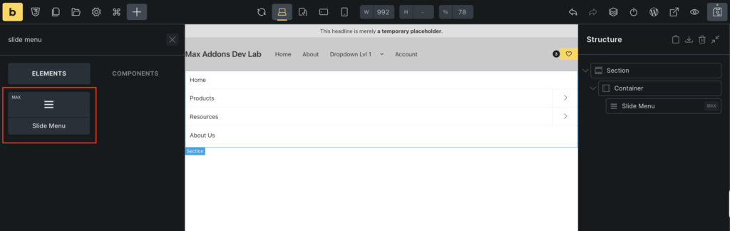
When the Slide Menu element appears in the search results, simply add the element to your page. As soon as you add the element, it will appear in the editor, and its settings will open in the left sidebar.
Configure the Content Tab
Now that you’ve added the Slide Menu element to your page, it’s time to configure how your multilevel navigation menu works.
When you select the Slide Menu element, you’ll notice two tabs in the left sidebar:
- Content
- Style
We’ll begin with the Content tab, where you’ll define the menu’s functionality and navigation behavior. Here, you’ll choose the WordPress menu to display, configure how the menu opens, customize submenu navigation, and adjust the appearance of different menu levels.
The Content tab is divided into five sections:
- Menu
- Main Menu
- Sub Menu
- Arrow
- Back
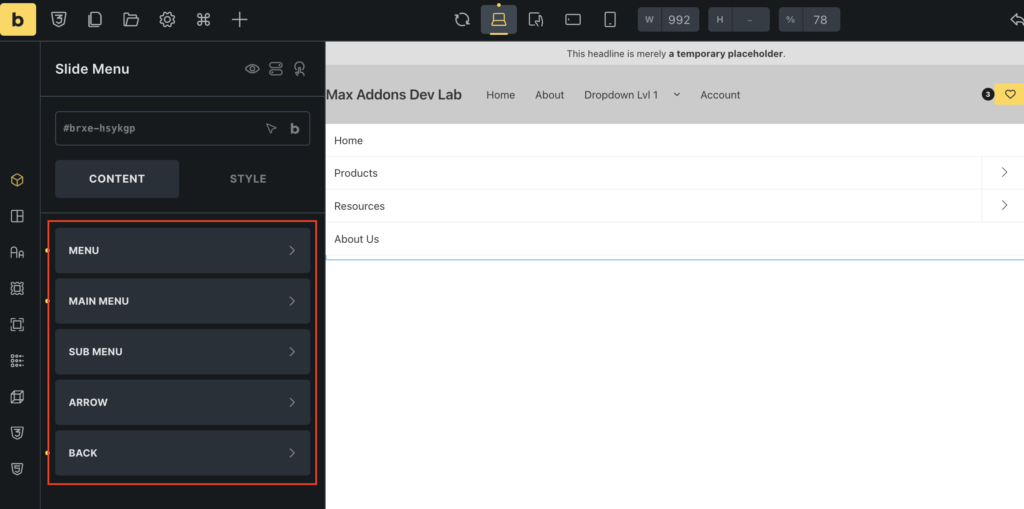
Let’s explore each section in detail.
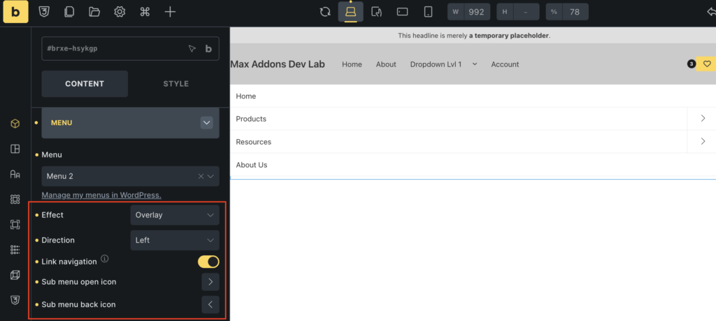
Define the Menu Settings
Menu section contains the primary settings that determine how your Slide Menu functions. Before customizing its appearance, you’ll first need to select your navigation menu and decide how visitors will interact with it.
Select the Navigation Menu
First option you’ll see is Menu. Click this dropdown to select the WordPress navigation menu you want to display inside the Slide Menu.
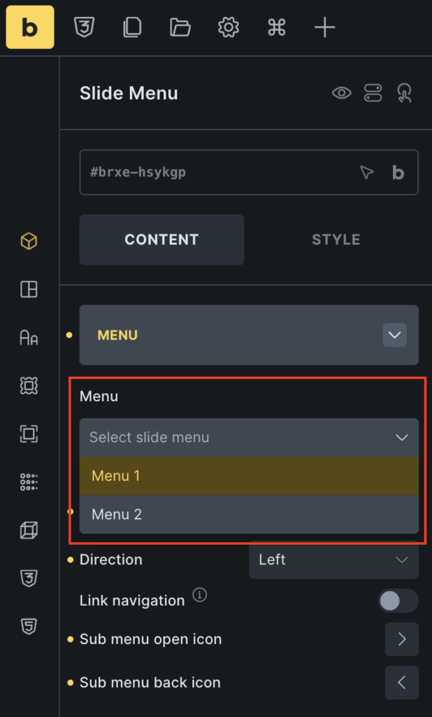
If you’ve already created a navigation menu in WordPress, simply select it from the list. The Slide Menu will automatically display all of its parent and child menu items.
If you haven’t created one yet, navigate to Appearance >> Menus in your WordPress dashboard and create your navigation menu first. Be sure to organize your menu items into parent and child levels, as these relationships determine how the multilevel navigation menu is displayed.
Once selected, the Slide Menu will automatically reflect your menu structure.
Choose How the Menu Opens
Next is the Effect option.
This setting controls how the Slide Menu appears when a visitor opens it. You can choose between two animation effects:
- Overlay: The menu slides over your existing page content without affecting the layout underneath. This is the most common choice for mobile navigation because it allows visitors to quickly open and close the menu without moving the page.
- Push: Instead of covering the page, the menu pushes the page content aside as it opens. This creates a more interactive effect and works well for side navigation layouts or modern website designs.
Set the Slide Direction
Direction option determines where the menu appears from when it’s opened. Available directions include: Left, Right, Top, and Bottom.
For most websites, Left and Right are the preferred choices because they’re familiar to users and provide a smooth navigation experience. However, if you’re designing a unique layout, you can also display the menu from the top or bottom of the screen.
You can experiment with different directions to see which works best for your design.
Configure Menu Link Navigation
Link Navigation option controls what happens when visitors click a menu item that contains child pages.
This setting is especially important for multilevel navigation menus because it determines how users access submenus.
- Enabled: When enabled, clicking a parent menu item immediately redirects visitors to the linked page.
- Disabled: When disabled, clicking the parent menu item opens its submenu instead of navigating to another page. If your parent menu items primarily serve as categories with multiple pages, disabling this option usually improves the browsing experience. Visitors can explore the submenu before deciding which page they’d like to visit.
Choose an Icon for Expandable Menu Items
Parent menu items that contain child pages should clearly indicate that they can be expanded. The Sub Menu Open Icon option lets you choose the icon displayed beside these menu items.
Click the icon selector and choose any icon available in the Bricks icon library. Popular choices include: Chevron Right, Angle Right, Arrow Right, Plus.
Customize the Back Navigation Icon
As visitors move deeper into your navigation, they’ll need an easy way to return to the previous menu level. The Sub Menu Back Icon option lets you customize the icon shown next to the Back button.
Most websites use a Left Arrow or Chevron Left because they’re familiar and instantly recognizable.
Selecting an appropriate back icon improves navigation and makes it easier for visitors to move between different menu levels.
Customize the Main Menu Appearance
Once you’ve configured the menu’s functionality, you can begin styling the main navigation items.
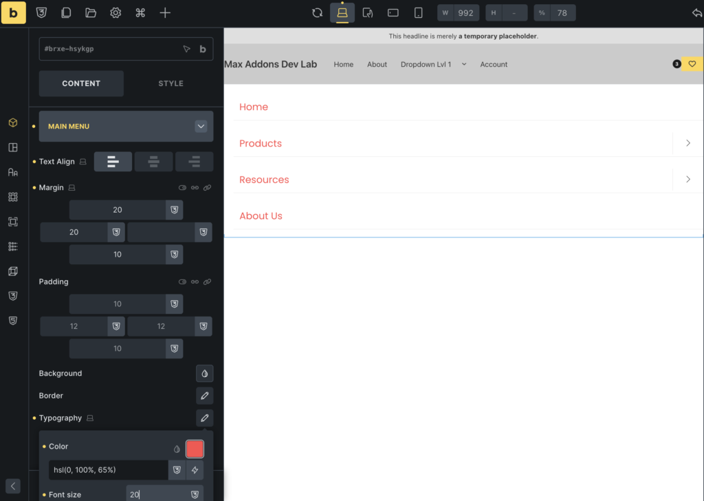
The Main Menu section allows you to control the alignment, spacing, colors, borders, and typography of your primary menu items. These settings affect the first level of your navigation menu and help create a consistent look across your website.
Let’s explore each option.
Align the Main Menu Text
Text Align option controls how text within your menu items is aligned. You can choose between Left, Center, or Right. For most websites, Left alignment offers the best readability because visitors naturally scan menus from left to right.
However, depending on your website’s design, center or right alignment may better complement your layout.
Adjust the Spacing Around Menu Items
Margin option controls the space outside each menu item.
Increasing the margin creates additional space between menu items, making the navigation feel more open and easier to scan.
Reducing the margin results in a more compact menu, which can be useful when displaying many navigation items.
Add Padding to Menu Items
Padding setting controls the space inside each menu item.
Increasing the padding makes menu items larger, improving readability and making them easier to click or tap, especially on mobile devices.
Change the Menu Item Background
Background option lets you customize the background of your menu items. You can apply: Solid Color or Gradients.
Add Borders to Menu Items
Border option allows you to add borders around each menu item. You can customize: Border width, Border style, and Border color.
Customize the Menu Typography
Customize the Submenu Appearance
Now that your main navigation is styled, it’s time to customize the submenu items.
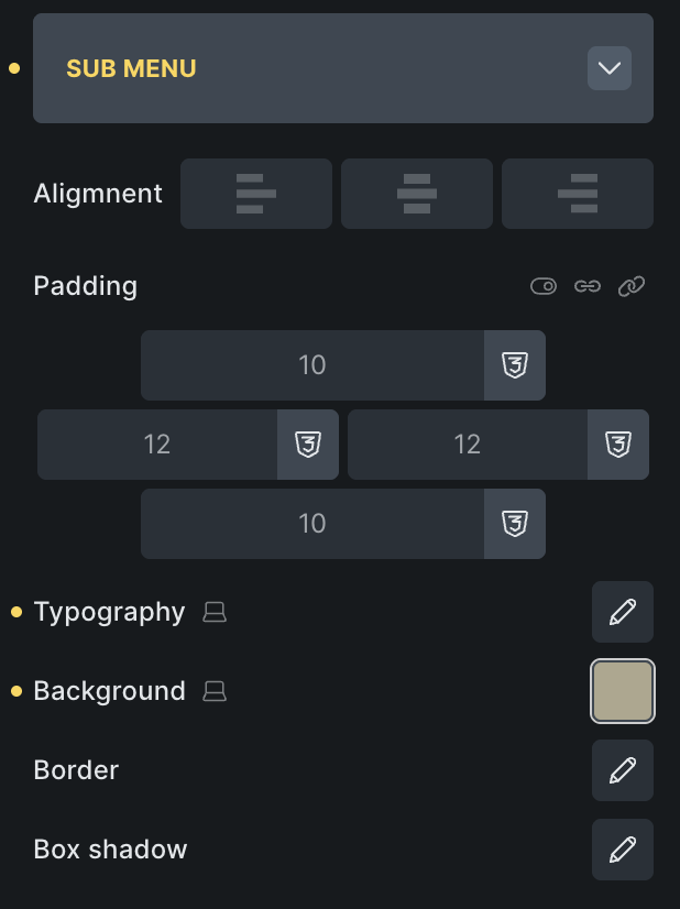
The Sub Menu section includes many of the same styling options as the Main Menu section, but they apply only to child menu items. This allows you to visually distinguish submenus while maintaining a consistent design.
You can customize: Text alignment, Padding, Typography, Background, Border, Box shadow and more!
For example, many websites use a slightly different background color for submenu items to help visitors distinguish them from the main navigation.
You can also add a subtle box shadow to create depth and make submenu panels stand out against the page.
Customize the Menu Arrow Icons
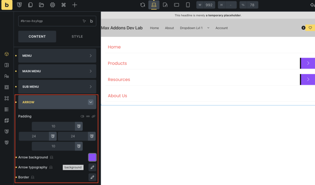
To help visitors identify menu items that contain additional navigation levels, you can customize the submenu arrow icons.
Arrow section lets you style these icons so they match the rest of your navigation.
You can adjust:
- Adjust the Arrow Icon Spacing
- Change the Arrow Background
- Customize the Arrow Icon Size and Color
- Add a Border Around the Arrow Icon
Customize the Back Navigation
As visitors browse through different submenu levels, they’ll need a simple way to return to the previous menu.
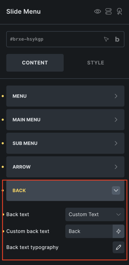
Back section lets you customize both the text and the appearance of the Back navigation, making it easier for users to navigate your menu hierarchy.
Choose the Back Button Label
Back Text option lets you decide what label appears when users navigate into a submenu. You can choose from two options:
Custom Text: Enter your own label, such as: Back, Go Back, Previous Menu.
Parent Menu Item Label: Instead of displaying custom text, the menu automatically shows the parent menu item’s name. This gives visitors additional context by reminding them which section they’re returning to.
Style the Back Button Text
Finally, use the Back Text Typography settings to customize the Back button’s appearance. You can adjust: Font size, Font family, Font weight, Text color.
Now that you’ve configured both the functionality and appearance of your menu through the Content tab, your multilevel navigation menu is fully functional.
In the next part, we’ll switch to the Style tab to refine the overall design, customize additional styling options, and preview and test your menu before publishing it.
Configure the Style Tab, Preview the Menu, and Publish Your Changes
At this stage, your multilevel navigation menu is fully functional. Visitors can navigate through parent and child menu items, and all the interactions you configured in the Content tab are now in place.
The final step is to customize the menu’s appearance so it blends seamlessly with your website’s overall design.
To do this, switch to the Style tab in the Slide Menu settings.
Style tab gives you complete control over its appearance. You can adjust colors, typography, spacing, backgrounds, borders, and other design elements to create a navigation menu that complements your website’s branding.
Let’s explore the available styling options.
Customize the Overall Appearance
\Style tab provides several styling controls to personalize your Slide Menu. Depending on your design requirements, you can customize various parts of the menu to create a polished, professional navigation experience.
Here are some of the most commonly used styling options. Customize Colors, Adjust Typography, Modify Spacing, Customize Borders and Shadows, Style Hover and Active States and more.
Make Your Menu Match Your Website
While styling your menu, aim for consistency rather than using too many different colors or effects. Here are a few best practices to keep in mind:
- Use your website’s primary and secondary brand colors.
- Keep typography consistent across all pages.
- Maintain enough spacing between menu items.
- Use hover effects to improve usability without overwhelming users.
- Test your design on both desktop and mobile devices.
Preview and Test Your Navigation Menu
Once you’ve finished customizing the menu, it’s important to test it before publishing your page. Click the Save button in Bricks Builder and preview your page.
Take a few moments to interact with the menu just as a visitor would.
Here’s a quick checklist to help you verify everything is working correctly:
- Confirm the correct WordPress menu is displayed.
- Open each parent menu item to ensure the submenus expand properly.
- Check that the slide animation works smoothly.
- Verify the Back button returns to the previous menu level.
- Test every navigation link to make sure it redirects to the correct page.
- Resize your browser window or preview the page on a mobile device to ensure the menu remains responsive.
Testing your menu before publishing helps you identify any issues and ensures your visitors have a smooth browsing experience from the moment they arrive on your website.
Tips for Creating an Effective Multilevel Navigation Menu
Before publishing your website, keep these best practices in mind:
- Keep Your Navigation Organized: Avoid placing too many items in the main navigation. Group related pages under parent menu items to keep the menu clean and easy to browse.
- Use Clear Menu Labels: Choose menu names that clearly describe the pages they contain. Simple labels help visitors find information more quickly.
- Don’t Create Too Many Levels: Although the Slide Menu supports multiple levels of submenus, using too many nested menus can make navigation confusing. Try to keep your menu hierarchy as simple as possible.
- Make Mobile Navigation a Priority: Many visitors browse websites from mobile devices. Always test your Slide Menu on smaller screens to ensure it’s easy to navigate using touch controls.
- Keep Your Design Consistent: Match the menu’s typography, colors, spacing, and icons with the rest of your website to create a cohesive user experience.
Wrapping Up!
A well-organized navigation menu makes it easier for visitors to explore your website and quickly find the information they’re looking for. As your website grows, a multilevel navigation menu becomes an effective way to organize pages into a clear and easy-to-follow structure.
With the Slide Menu element from Max Addons for Bricks, you can create a fully responsive multilevel navigation menu without writing a single line of code. Its drag-and-drop interface, flexible layout options, and extensive customization settings make it easy to build a navigation menu that matches your website’s design while delivering a smooth browsing experience.
By following this guide, you’ve learned how to:
- Add the Slide Menu element to your page.
- Configure the menu’s functionality using the Content tab.
- Customize its appearance using the Style tab.
- Test the menu to ensure it works seamlessly across different devices.
Now it’s time to experiment with different layouts, animations, colors, and typography to create a navigation menu that not only looks great but also enhances your website’s overall user experience.
And if you’re looking for some other menu types, you can check out our guide: How To Create Off Canvas Menu in Bricks Builder [Without Any Coding]
So, are you ready to create a multilevel navigation menu on your Bricks Builder website? Get Max Addons today!
And if you found this tutorial useful, feel free to share your thoughts by commenting below!
