Max Addons Nestable Table element for Bricks Builder lets you create fully customizable, interactive tables directly in the Bricks editor.
Unlike regular table elements, the Nestable Table lets you place different Bricks elements within table cells, giving you complete flexibility over your table design and content.
You can easily add Text, Images, Buttons, Icons, Lists, Badges, Other nested elements, and even additional tables.
This makes the element perfect for Pricing tables, Feature comparison tables, Product specification tables, Team or service listings, Data tables with custom layouts, or Interactive content sections.
Getting Started#
Before using the Nestable Table element, make sure the following tools are installed and activated on your WordPress website:
Once both tools are active, you’re ready to start creating custom tables using the Nestable Table element.
How to Add the Nestable Table Element#
Follow these steps to add the Nestable Table element to your page:
- Open a page or create a new page in WordPress.
- Click Edit with Bricks to open the Bricks Builder editor.
- Inside the editor, click the element search bar and type: Nestable Table.
- Add the Table (Nestable) element onto your page.
- After adding the element, make sure you see the MAX label in the top-left corner. This confirms you are using the Max Addons Nestable Table element.
Once the element is added, you’ll see two main tabs in the element settings panel: Content & Style Tab
Content Tab#
Content tab allows you to create and manage the table structure, rows, columns, and cell content. It includes the following sections:
- General
- Header Style
- Rows Style
- Cells Style
Each section helps you customize different parts of the table layout and appearance.
General#
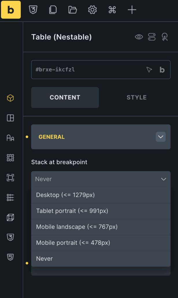
General section lets you control the Nestable Table element's responsive behavior. From here, you can define how the table behaves on different screen sizes, especially on tablets and mobile devices.
Currently, this section includes the following option:
Stack at Breakpoint#
Stack at Breakpoint option helps make your tables responsive on smaller devices.
When enabled, the table layout automatically stacks rows and columns vertically once the selected breakpoint is reached. This improves readability and prevents horizontal scrolling on smaller screens.
Available Options: Never, Tablet Portrait, Mobile Landscape, Mobile Portrait.
Understanding the Table Structure (Right Panel)#
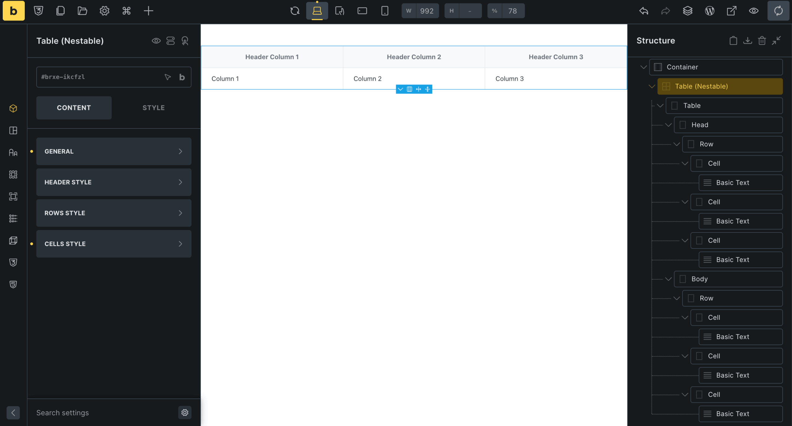
On the right side of the Bricks Builder editor, you’ll see the Structure Panel. This panel displays the complete hierarchy of the Nestable Table element, making it easier to manage rows, cells, and nested content.
The Nestable Table is organized into multiple layers:
- Table
- Head
- Body
- Row
- Cell
- Nested Elements
This structure makes it easy to build advanced table layouts using drag-and-drop functionality.
Table#
Table Section serves as the main wrapper for the entire table layout. It contains:
- Header section
- Body section
- All rows and cells inside the table
Head#
Head section represents the table header area. This section is typically used for: Column titles, Labels, and Heading content.
Example:
- Header Column 1
- Header Column 2
- Header Column 3
The Head section usually contains one or more rows.
Body#
Body section contains the main table content. This is where you add: Data rows, Feature lists, Pricing information, Product details, and Custom nested elements.
You can add multiple rows inside the Body section depending on your table requirements.
Row#
A row represents a horizontal section within the table. Each row can contain multiple cells. You can duplicate rows, delete rows, reorder rows, and add additional cells.
This makes it easy to create structured table layouts.
Cell#
A cell represents an individual column area inside a row. Each cell can contain nested Bricks elements, such as Text, Images, Icons, Buttons, Dividers, Lists, Containers, and Other custom elements.
Since the table is fully nestable, you can create highly customized layouts inside every cell.
Nested Elements Inside Cells#
Inside each cell, you’ll notice elements like Basic Text in the structure panel. These are the actual content elements placed inside the table cell.
You can replace them with any supported Bricks or Max Addons element to create custom table designs.
Example Use Cases
You can create:
- Pricing tables with buttons
- Product comparison tables with icons
- Team information tables with images
- Service tables with badges and ratings
- Interactive layouts with multiple nested elements
Header Style#
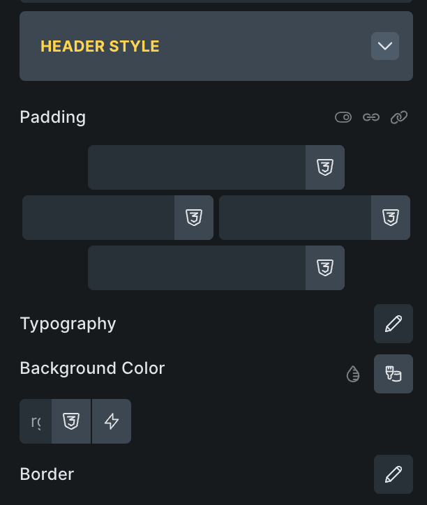
Header Style section lets you customize the appearance of the table header. Using these settings, you can control the spacing, typography, colors, and borders of your header rows and columns.
This helps you create visually appealing table headers that stand out from the rest of the table content.
The Header Style section includes the following options: Padding, Typography, Background Color, and Border.
Rows Style#
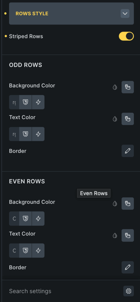
Rows Style section lets you customize the appearance of table rows within the Nestable Table element. Using these settings, you can style odd and even rows separately to create better visual separation and improve table readability.
The Rows Style section includes the following options:
- Striped Rows
- Odd Rows Styling
- Even Rows Styling
Striped Rows#
Striped Rows option allows you to apply alternating row styles throughout the table body.
When enabled:
- Odd rows and even rows can have different colors and borders.
- Table content becomes easier to scan
- Large tables become more readable.
Odd Rows#
Odd Rows section lets you customize the appearance of rows positioned in odd order numbers, such as Row 1, Row 3, Row 5
You can style these rows independently from even rows. The following styling options are available:
- Background Color
- Text Color
- Border
Even Rows#
Even Rows section allows you to style even-numbered rows, such as Row 2, Row 4, Row 6.
This works exactly like the Odd Rows styling section, but applies only to even rows. The following options are available:
- Background Color
- Text Color
- Border
Cells Style#
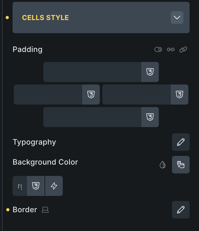
Cells Style section allows you to customize the appearance of all table cells within the Nestable Table element. These settings help you control the spacing, typography, colors, and borders applied to the table content area.
Using the Cells Style settings, you can create clean, readable, and visually appealing table layouts that match your website design.
The Cells Style section includes the following options: Padding, Typography, Background Color, and Border.
Wrapping Up!#
Nestable Table element in Max Addons for Bricks Builder gives you complete flexibility to create fully customized and interactive table layouts directly inside the Bricks editor.
With support for nested elements, responsive controls, customizable headers, striped rows, advanced cell styling, and drag-and-drop editing, you can build everything from simple data tables to advanced comparison and pricing layouts without writing any code!