Forms are an essential part of almost every website. From contact and registration forms to booking and customer survey forms, choosing the right form fields helps you collect accurate information and improve the overall user experience.
While the native Form element in Bricks Builder provides several standard input fields, Max Addons for Bricks Builder extends its functionality with a collection of Advanced Form Fields.
These fields allow you to collect specialized information, create interactive forms, and build more engaging user experiences without relying on additional plugins.
Currently, Max Addons includes the following form fields:
- International Phone
- Range
- Signature
- Calculator
- Color
- Step Break
- Star Rating
- Toggle Switch
Each field is designed for a specific purpose and includes its own customization options, making it easy to build forms that meet your website’s requirements.
In this guide, you’ll learn how to enable Max Addons Form Fields and use each field to build more powerful and user-friendly forms in Bricks Builder.
Max Addons Form Fields for Bricks Builder#
Let's check the features and functionalities of each form field in detail!
But...
Before You Begin#
Before adding any Max Addons form field to your form, you’ll first need to enable the feature from the plugin settings.
Enable Form Fields
- From your WordPress dashboard, navigate to Bricks >> Max Addons.
- Open the Extensions tab.
- Locate the Form Fields extension.
- Enable the extension and turn on the individual form fields you want to use.
- Click Save Changes.
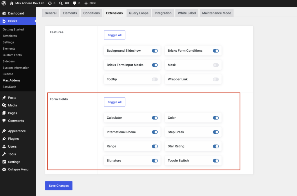
Once enabled, the selected form fields become available inside the native Form element in Bricks Builder.
International Phone Field#
Collecting accurate phone numbers is important for businesses that serve customers across different countries. International Phone field makes this process easier by allowing users to enter phone numbers with the correct country code and formatting.
Instead of asking users to enter international dialing codes manually, this field provides a country selector with flags and automatically formats the phone number based on the selected country.
This helps reduce input errors and ensures that the collected phone numbers are standardized for use in your CRM, email marketing tools, or SMS platforms.
Key Features#
The International Phone field includes:
- Country selector with flags and dialing codes
- Automatic phone number formatting
- Phone number validation
- Support for preferred and allowed countries
- Default country selection
How to Add an International Phone Field#
Follow these steps to add an International Phone field to your form.
- Open the page in the Bricks Builder editor.
- Add the Form element to your page.
- Under the Fields section, click + Add Field.
- From the Type dropdown, select International Phone [Max Addons].
The International Phone field is now added to your form. You can now configure its settings to match your requirements.
International Phone Field Settings#
Let’s take a look at the available settings.
- Label: Enter the text that appears above the phone number field.
- Placeholder: The placeholder displays helper text inside the input field before users start typing.
- Value: Use this option to define a default value for the field.
- Attribute: Name: The Attribute: Name creates a unique identifier for the field when the form is submitted.
- Error Message: Customize the validation message shown when users enter an invalid phone number or leave a required field empty.
- Width (%): Adjust the width of the phone field within the form layout.
- Required: Enable this option if users must provide their phone number before submitting the form.
- Default Country: Choose the country that should be selected when the form first loads.
- Enable Validation: Turn on Enable Validation to verify that the entered phone number follows the correct format for the selected country.
- Allowed Countries: If your business serves customers only in specific regions, use Allowed Countries to limit the country dropdown to those regions.
- Preferred Countries: Use Preferred Countries to display frequently selected countries at the top of the dropdown list.
Example#
Imagine you’re creating a travel booking form for an international audience. To make it easier for visitors to enter their contact details:
- Set India as the default country if most of your customers are based there.
- Add the United States, the United Kingdom, and Australia as preferred countries.
- Enable Validation to ensure every submitted phone number is properly formatted.
This creates a smoother user experience while ensuring your team receives accurate contact information.
The International Phone field is an excellent choice for websites that serve customers across multiple countries. It simplifies phone number collection, reduces validation errors, and creates a more professional form experience.
Range Field#
Range field adds an interactive slider to your form, allowing users to select a numeric value by dragging the slider instead of typing it manually. It’s a simple and intuitive way to collect numeric input, making forms more engaging and easier to complete.
Range field is ideal when users need to choose a value within a predefined range, such as a budget, age, quantity, percentage, or donation amount.
You can use the Range field for:
- Budget or price selection
- Donation amount
- Age selection
- Product quantity
- Experience level
- Satisfaction ratings
- Percentage-based inputs
How to Add a Range Field#
Follow these steps to add a Range field to your form.
- Open your page in the Bricks Builder editor.
- Add the Form element to the page.
- Under the Fields section, click + Add Field.
- From the Type dropdown, select Range [Max Addons].
The Range field is now added to your form.
Range Field Settings#
After adding the field, you can customize it using the available options.
- Label: Enter the name that appears above the slider.
- Placeholder: Although sliders don’t display placeholder text inside the field, you can use this option to provide additional guidance where applicable.
- Value: Use this option to define the default value displayed when the form loads.
- Attribute: Name: Assign a unique field name for form submissions.
- Error Message: Customize the validation message that appears when a required value is missing.
- Width (%): Control how much horizontal space the slider occupies inside the form.
- Required: Enable this option if users must select a value before submitting the form.
- Minimum Value: Define the lowest value users can select.
- Maximum Value: Specify the highest value available on the slider.
- Step Size: The Step Size determines how much the slider moves each time it’s dragged.
Example#
Suppose you’re creating a donation form. You want visitors to choose how much they’d like to donate instead of typing an amount manually.
You could configure the Range field like this:
- Label: Donation Amount
- Minimum Value: 10
- Maximum Value: 500
- Step Size: 10
- Default Value: 50
Visitors can simply drag the slider to select their preferred donation amount, creating a faster and more interactive experience.
Signature Field#
Signature field allows users to draw their signature directly within your form using a mouse, touchscreen, or stylus.
Instead of printing, signing, and uploading documents, users can sign digitally before submitting the form. This streamlines online workflows and provides a more convenient experience.
The Signature field works well for:
- Consent forms
- Service agreements
- Online contracts
- Delivery confirmations
- Registration forms
- Waivers
- Customer acknowledgements
How to Add a Signature Field#
Follow these steps to include a Signature field in your form.
- Open your page in the Bricks Builder editor.
- Add the Form element.
- Click + Add Field.
- From the Type dropdown, choose Signature [Max Addons].
The signature pad is now ready to be customized.
Signature Field Settings#
- Label: Enter the title displayed above the signature pad.
- Placeholder: Add helper text inside the signature area before users begin signing.
- Value: This option lets you define a default value. Since users provide signatures, this field is typically left empty.
- Attribute: Name: Assign a unique identifier for the signature field.
- Error Message: Display a custom validation message when the signature is required but missing.
- Width (%): Adjust the width of the signature field to fit your form layout.
- Required: Enable this option to make the signature mandatory before the form can be submitted.
- Canvas Width: Specify the width of the signature pad.
- Canvas Height: Adjust the height of the signature area. Increasing the height creates a more natural signing experience, especially on touch devices.
- Stroke Color: Choose the color of the digital pen used for signing.
- Stroke Width: Adjust the thickness of the signature stroke.
- Background Color: Select the background color of the signature canvas.
- Show Clear Button: Enable this option to display a Clear button below the signature pad. If users make a mistake while signing, they can erase the signature and draw it again without refreshing the form.
Example#
Imagine you’re creating a service agreement form.
After entering their personal information, customers must confirm the agreement by signing digitally before submitting the form.
To improve the signing experience, you could configure the Signature field as follows:
- Enable Required
- Set the canvas to a comfortable width and height
- Use a black stroke color for better readability
- Enable the Clear button so users can redraw their signature if needed
This allows customers to complete the entire agreement online without downloading or printing any documents.
Calculator Field#
Calculator field allows you to perform automatic calculations within your form based on user input. Instead of manually calculating totals, costs, or estimates, you can define a formula that updates the result instantly as users complete the form.
This field is ideal for creating interactive forms that provide real-time calculations, helping users make informed decisions before submitting the form.
The Calculator field can be used for:
- Price calculators
- Quote request forms
- Loan or EMI calculators
- Product cost estimators
- Service pricing forms
- Booking and reservation forms
How to Add a Calculator Field#
Follow these steps to add a Calculator field to your form.
- Open your page in the Bricks Builder editor.
- Add the Form element.
- Under the Fields section, click + Add Field.
- From the Type dropdown, select Calculator [Max Addons].
Once it’s added, you can configure the calculator to meet your requirements.
Calculator Field Settings#
- Label: Enter the title displayed above the calculator field.
- Value: Use this option to define a default value for the calculator.
- Attribute: Name: Assign a unique identifier to the calculator field.
- Width (%): Adjust the width of the calculator field within the form layout.
- Required: Enable this option if the calculated value is mandatory before the form can be submitted.
- Formula: The Formula field is where you define how the final value should be calculated. You can create formulas that use values from other form fields to generate totals or estimates automatically.
- Decimal Places: Specify how many decimal places should appear in the calculated value.
- Prefix: Add text before the calculated value.
- Suffix: Add text after the calculated value.
Example#
Suppose you’re creating a painting service quote form. The customer enters:
- Wall Width
- Wall Height
The Calculator field automatically calculates the total area and displays the estimated painting cost. This provides instant pricing without requiring visitors to perform calculations themselves.
Color Field#
The Color field lets users choose a color directly in your form with an intuitive color picker. Instead of typing color codes manually, users can simply click the field and select a color visually.
This field is useful whenever users need to customize products or specify color preferences.
The Color field is ideal for:
- Product customization forms
- Branding questionnaires
- Design request forms
- Logo design inquiries
- Theme customization requests
- Print and merchandise orders
How to Add a Color Field#
Follow these steps to add a Color field to your form.
- Open your page in the Bricks Builder editor.
- Add the Form element.
- Click + Add Field.
- From the Type dropdown, choose Color [Max Addons].
The color picker is now added to your form.
Color Field Settings#
- Label: Enter the text displayed above the color picker.
- Attribute: Name: Assign a unique name for the field.
- Width (%): Control the width of the color picker within your form.
- Required: Enable this option if selecting a color is mandatory before submitting the form.
- Default Color: Choose the color that appears when the form first loads.
Example#
Imagine you’re creating a custom T-shirt order form.
Customers can choose:
- T-shirt Size
- Quantity
- Preferred T-shirt Color
Using the Color field, visitors can simply click the color picker to select their preferred color, rather than typing the color name manually.
Step Break Field#
Long forms can sometimes feel overwhelming, causing users to abandon them before completion. The Step Break field helps solve this by dividing a single form into multiple steps, making it easier to complete one section at a time.
Instead of displaying every field on a single page, you can organize related fields into logical sections to create a cleaner, more user-friendly experience.
The Step Break field is especially useful for forms that collect a large amount of information. You can use this field for:
- Multi-step registration forms
- Job application forms
- Loan application forms
- Checkout forms
- Event registration forms
- Survey and questionnaire forms
How to Add a Step Break Field#
Follow these steps to divide your form into multiple sections.
- Open your page in the Bricks Builder editor.
- Add the Form element.
- Under the Fields section, click + Add Field.
- From the Type dropdown, select Step Break [Max Addons].
Once added, the Step Break field separates your form into multiple steps.
Step Break Field Settings#
- Label: Enter a label to help identify the field within the editor.
- Placeholder: Use this option to add helper text if required.
- Value: Define a default value if needed.
- Attribute: Name: Assign a unique name to the Step Break field.
- Attribute: Title: Enter the title displayed at the top of each form step.
- Error Message: Customize the validation message that appears when users attempt to continue without completing the required fields.
- Width (%): Adjust the width of the Step Break field within your layout.
- Required: Enable this option if users must complete all required fields in the current step before moving to the next one.
- Step Title: Assign a meaningful heading to each section of your form.
Example#
Suppose you’re creating an event registration form. Instead of displaying every field on one page, you could divide the form into three steps:
Step 1
- Name
- Phone Number
Step 2
- Ticket Type
- Number of Attendees
- Meal Preference
Step 3
- Payment Details
- Terms & Conditions
- Submit
Star Rating Field#
Star Rating field allows users to rate their experience, service, or product directly within your form.
Instead of typing feedback, visitors can simply click the desired number of stars, providing a quick and intuitive way to rate.
The Star Rating field works well for:
- Customer feedback forms
- Product reviews
- Service evaluations
- Course feedback
- Event surveys
- Website satisfaction forms
How to Add a Star Rating Field#
Follow these steps to add a Star Rating field.
- Open your page in the Bricks Builder editor.
- Add the Form element.
- Click + Add Field.
- From the Type dropdown, select Star Rating [Max Addons].
The rating field is now added to your form.
Star Rating Field Settings#
- Label: Enter a descriptive label for the rating field.
- Value: Specify the default rating value if required.
- Attribute: Name: Assign a unique identifier for the rating field.
- Width (%): Adjust the width of the rating field within your form.
- Required: Enable this option to make submitting a rating mandatory.
- Number of Stars: Choose how many stars to display.
- Star Color: Customize the color of the rating stars to match your website’s branding.
- Star Size: Adjust the star size to improve visibility or to match your form’s design.
Example#
Imagine you’re creating a customer feedback form after a completed service. Your form could include:
- Overall Rating ⭐⭐⭐⭐⭐
- Comments
- Suggestions
This allows customers to provide quick feedback before submitting the form.
Toggle Switch Field#
Toggle Switch field provides a modern alternative to traditional checkboxes. Instead of selecting a checkbox, users simply switch the toggle between On and Off.
This creates a cleaner interface and makes binary choices easier to understand.
Use the Toggle Switch field for:
- Accepting terms and conditions
- Newsletter subscriptions
- Email notifications
- Marketing preferences
- Turn optional services on or off
- Feature selections
How to Add a Toggle Switch Field#
Follow these steps to add a Toggle Switch field.
- Open your page in the Bricks Builder editor.
- Add the Form element.
- Click + Add Field.
- From the Type dropdown, select Toggle Switch [Max Addons].
The toggle switch is now ready to be configured.
Toggle Switch Field Settings#
- Label: Enter the text displayed next to the switch.
- Attribute: Name: Assign a unique field name.
- Error Message: Customize the validation message displayed if the switch is required but hasn’t been enabled.
- Width (%): Adjust the width of the field within your form layout.
- Required: Enable this option if users must turn on the switch before submitting the form.
- Value When On: Specify the value submitted when the toggle is enabled.
- On by Default: Enable this option to have the switch turn on automatically when the form loads.
- On Color: Customize the color displayed when the switch is enabled.
Example#
Suppose you’re creating a newsletter signup form.
Instead of adding a traditional checkbox, you can include a Toggle Switch labeled Subscribe to our newsletter.
When users enable the switch, the form submits the value Subscribed, making it easy to identify subscribers in your email marketing platform.
Wrapping Up!#
Max Addons Form Fields extend the native Bricks Builder Form element with powerful, interactive fields to help you create more dynamic forms. From collecting international phone numbers and digital signatures to adding calculators, multi-step forms, and star ratings, these fields make it easy to build forms that are both user-friendly and functional.
Looking to make your forms even more powerful? Check out Form Conditions in Max Addons for Bricks Builder to learn how to add conditional logic, show or hide fields based on user input, and create smarter, more personalized form experiences.