Table of Contents element lets you organize your page content & enhance user experience on your websites. You can add a collapsible table of contents to your pages, posts, or templates.
Our TOC element automatically generates a list of clickable links to each page section based on the HTML headings used in the content.
For example, if the page has several sections with H1, H2, H3, and H4 headings, the TOC element will create a nested list of links to each section in the order they appear on the page.
Let's take a closer look at the Table of Contents element and see it in action.
Like every element of the Bricks Builder, you'll get two main tabs in the TOC element: Content and Style.
We'll start with the options in the Content Tab.
Content Tab of the Table of Contents element#
Content tab of the TOC element includes 2 sections:
- HEADER
- BODY
Header#
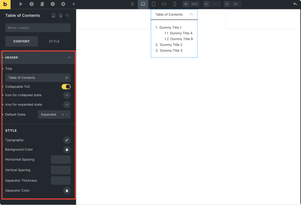
Title#
This option allows you to add a custom title to your table of contents.
Collapsable TOC#
Enable this feature to create a collapsible table of contents.
If you toggle on the Collapsable ToC button, you further get options to:
- add an icon for collapsed state
- add an icon for expanded state
- choose the default state for the TOC to display in Expanded or Collapsed state.
STYLE [Includes styling options for TOC Header]#
In this subsection, you'll find styling options for customizing your TOC header. You get the ability to change the Typography & Background Color.
Also, to create more clean designs, you can define Horizontal Spacing, Vertical Spacing & Separator Thickness.
Further, if you want to change the Separator Color, you can do that too.
BODY#
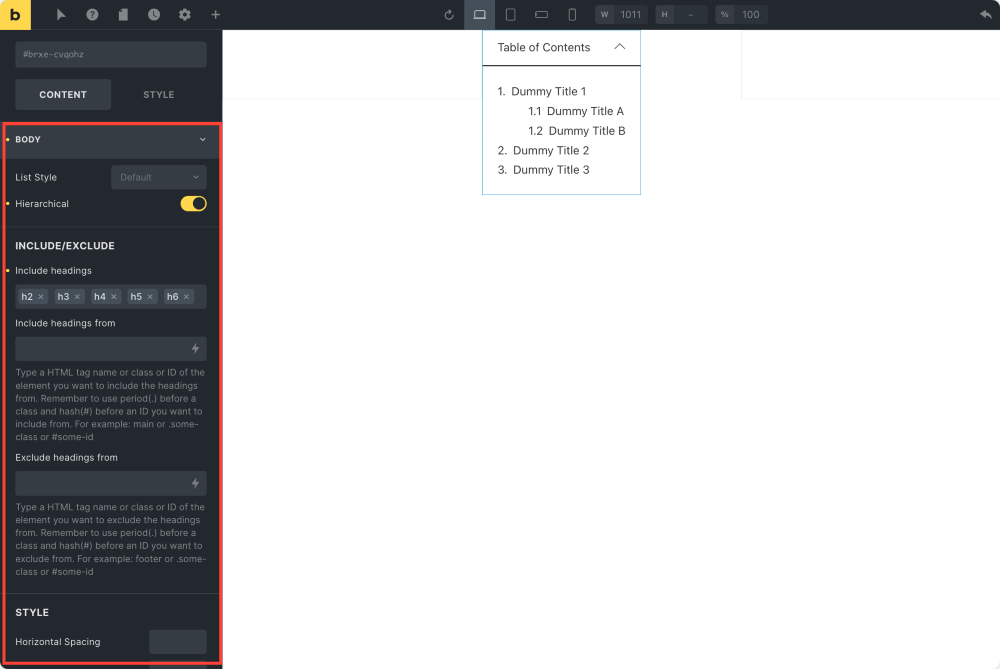
List Style
Using this option, you can choose the List Style for your table of contents. You can either select Numbers or Bullets style as per your design preference.
Hierarchical#
Enable this option to create a hierarchy of headings in your table of contents. This is how your hierarchical table of contents will look like. <screenshot of the hierarchical table of contents>
INCLUDE/EXCLUDE#
This option allows you to include page headings in the table of contents simply by adding heading tags.
Further, if you need to include/exclude particular headings, you can achieve that by defining the class or ID of the element.
STYLE [Includes styling for TOC body contents]#
From the options given in this subsection, you can set Horizontal Spacing & Vertical Spacing of the body contents of your TOC.
Style Tab of the Table of Contents element#
There are main 5 sections in the Style Tab of the TOC elements:
- LAYOUT
- TYPOGRAPHY
- BACKGROUND
- BORDER/BOX SHADOW
- GRADIENT/OVERLAY
Layout#
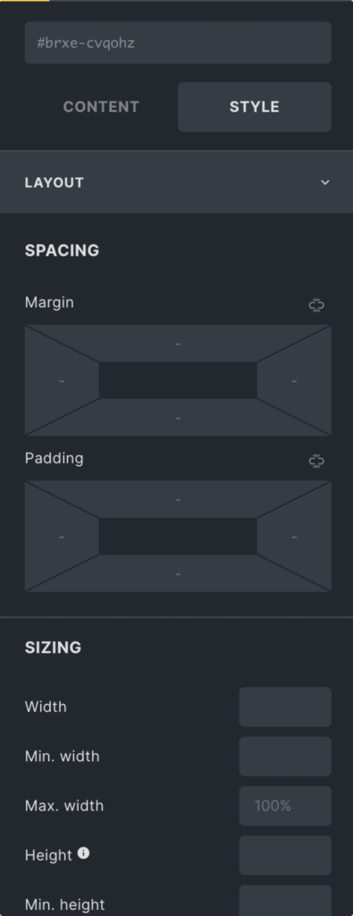
You can customize the TOC element's appearance using these styling options to match your website's design. The options in the Layout section allow you to define the Margin and Padding of your TOC.
Typography#
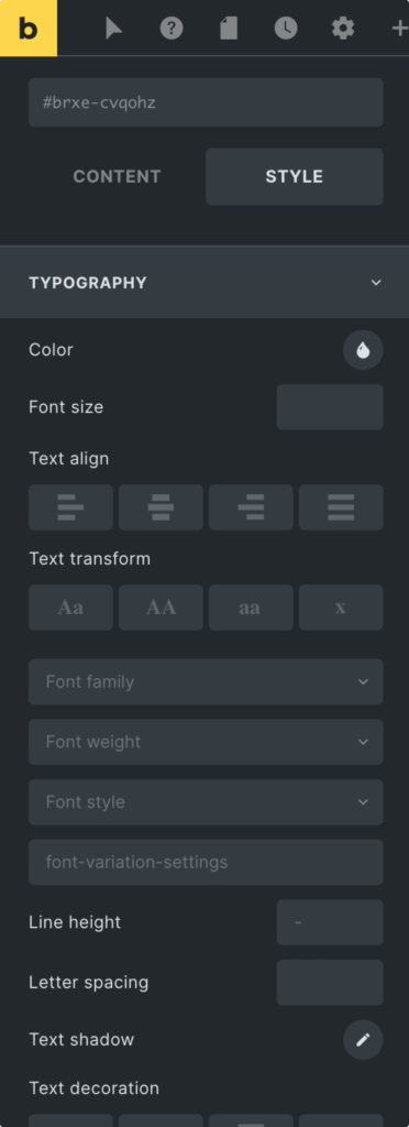
Using the Typography section, you can alter the color, font, and size of the TOC text content.
Background#
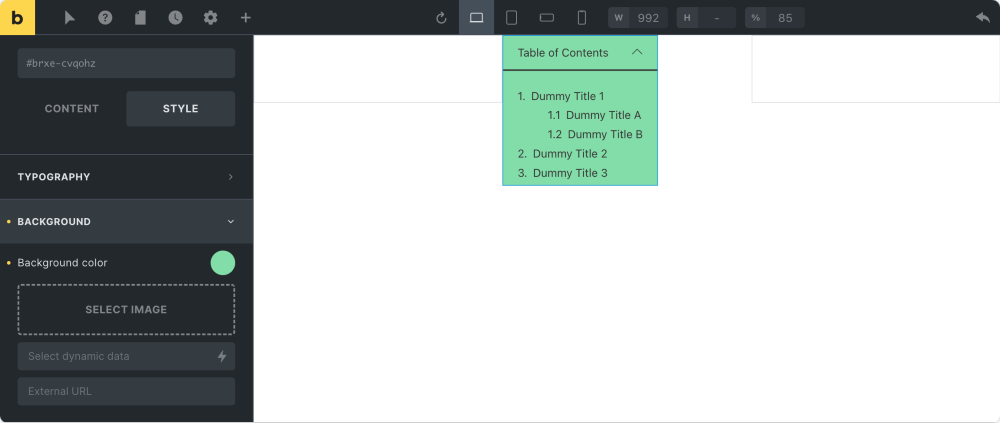
In the Background section, you'll find an option to change the background of your table of contents. You can choose a simple solid color or add an image and use it as a background for your TOC.
Border/Box Shadow#
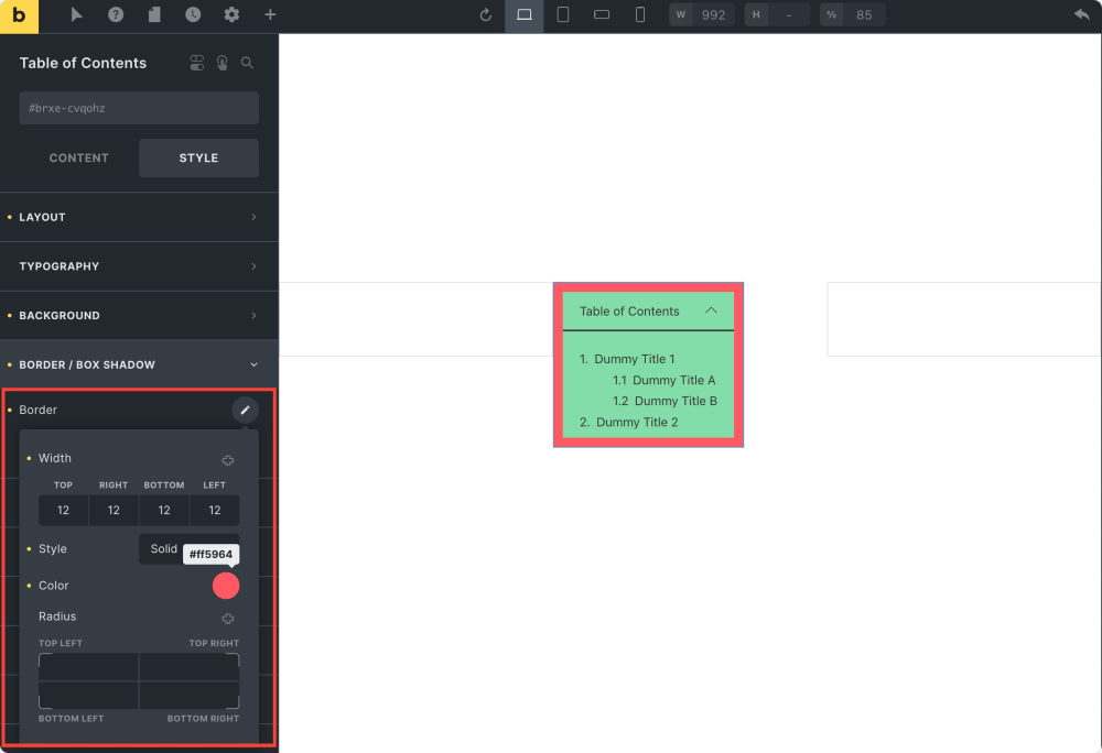
Further, if you want to add a Border and Box Shadow to make your table of contents more interactive, you can do that.
Gradient/Overlay#
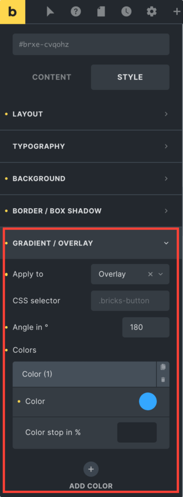
Lastly, if you need to create more visually appealing backgrounds, you can use the Gradient/Overlay option.
This was the complete overview of the Max Addons Table of Contents Element for Bricks Builder. We hope you find our TOC element useful!