Create awesome popups for your website using the powerful Modal Popup Builder of Max Addons. This nestable popup builder allows you to drag & drop any elements of your choice right inside the builder. You can enable multiple triggers for the popup and set the delay to re-trigger a popup as you need. Let's explore all available options of Modal Popup Builder.
Triggers#
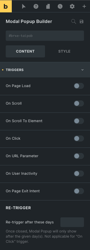
- On Page Load - Enabling this option will trigger the Modal Popup when a visitor lands on the page. You can specify a delay to wait for the popup to trigger after the page load.
- On Scroll - It triggers the popup when a visitor scrolls the page to a certain percentage specified by you. You can also set the "up" or "down" scroll direction for the popup to trigger.
- On Scroll To Element - This option triggers the popup when a visitor scrolls the page to the specified element.
- On Click - This option triggers the popup when a visitor clicks on an element you specify by CSS ID or Class name.
- On URL Parameter - Modal Popup can be triggered when it detects a parameter in the URL. You can specify your custom URL parameter in this option.
- Parameter Name - You can provide any name for the parameter. For example, https://example.com/?signup=1. Here "signup" after the "?" question mark is the parameter name.
- Parameter Value - You can provide any value for the parameter. In the above example, the value is "1"
- On User Inactivity - It triggers the Modal Popup when a visitor opens the page but doesn't interact for some time. You can specify the inactivity delay.
- On Page Exit Intent - The Modal Popup will be triggered when a visitor moves the cursor out of the viewport, or you can say when the visitor's mouse activity indicates intent to exit the page.
Re-Trigger#
- Re-trigger after these days - Set the number of days you want the popup to re-appear for the same visitor. Leaving blank will trigger the popup whenever the visitor lands on the page.
Conditions#
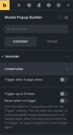
- Trigger after X page views - You can set the number of page views before the popup is triggered.
- Trigger up to X times - Enable this option if you want to limit how many times the popup can trigger. The popup will not trigger again after the specified number of times.
- Reset when re-trigger - If you've enabled the option "Trigger up to X times" and if you want to re-trigger the popup after certain days that you've specified under the "Re-trigger" setting, then enable this option so it will reset the number of times count and the popup will be triggered again after the given days.
Close Button#
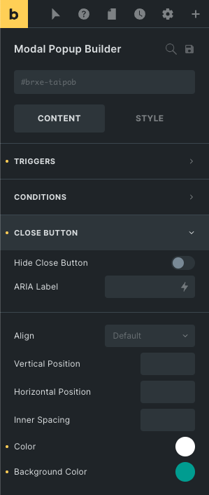
- Hide Close Button - Enabling this option will not show the close button in the modal popup.
- ARIA Label - You can specify an informative label for the close button in this field for accessibility purposes (such as screen reader)
- Align - Set the close button alignment - left or right. Choosing left will make the button appear at the leftmost corner of the Modal Popup.
- Vertical Position - You can adjust the top offset for the close button.
- Horizontal Position - You can adjust the left or right offset for the close button.
- Inner Spacing - It may be useful when setting the close button's background color.
Custom Close Button#
You can also set the attribute data-modal-popup-close to any element inside the Modal Popup to make it a custom close button.
Advanced#
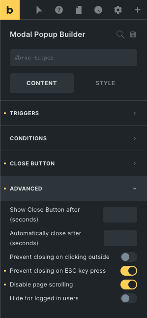
- Show Close Button after (seconds) - You can specify the number of seconds so that the close button will only appear after that time.
- Automatically close after (seconds) - Set the number of seconds to automatically close the popup after that time. Leave blank to disable automatic close.
- Prevent closing on clicking outside - Enabling this option will prevent visitors from being able to close the popup by clicking outside the popup box.
- Prevent closing on ESC key press - Enabling this option will prevent visitors from being able to close the popup by pressing the ESC key.
- Disable page scrolling - Enable this option if you want to prevent visitors to scroll the page showing behind the popup.
- Hide for logged in users - Enable this option to hide the popup for all logged-in users or users with a specific role.
Animations#
The entrance and exit animation controls are located right under the Style tab > Layout > Animation section.