Table element for Bricks is a very useful element when it comes to showing the comparison between products, office schedule, or restaurant menu. It's a multipurpose element and has many customization options available.
How to Use Table Element#
To add the Table element to the page and start using it, please follow the following steps:
Step 1: Go to Dashboard -> Bricks -> Max Addons -> Elements and make sure that the Table element is activated here. If it is not active, click on the button in front of it and then click on the Save Changes button.
Step 2: Now edit your page using Bricks and search for Table. Drag and drop it to a desired position on the page and start using it.
Element Options#
Table element is an advanced element and has many options that are arranged in 11 sections.
- General
- Header
- Body
- Footer
- Table Style
- Header Style
- Rows Style
- Cells Style
- Footer Style
- Icon Style
- Columns
Let's go through each section in detail.
General#
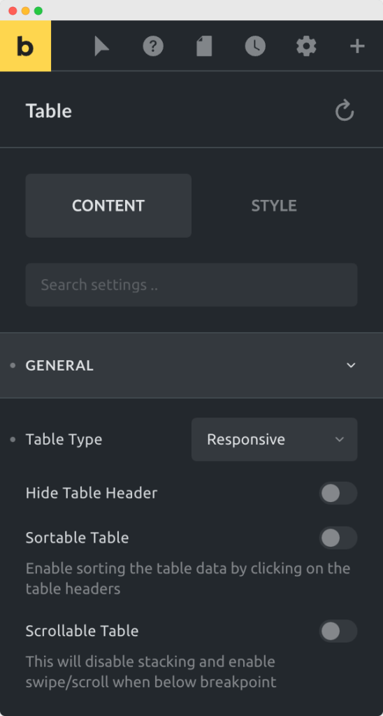
General section has options to control general settings for the table.

- Table Type - You can choose either a normal table that shows in same layout on all the resolutions or a responsive table that changes its layout on mobile resoultion.
- Hide Table Header - When you add the table to the page, table header is shown by default. You can choose to hide the table header with this option. If you hide the table header Sortable Table and Scrollable Table options will not work.
- Sortable Table - When this option is enabled, a dropdown is shown to sort the table contents. You can also sort the table by clicking on header of each column.
- Scrollable Table - This option enables horizontal scrolling for table for lengthy text when table is below defined breakpoint.
Header#
In the header section, you can create a header for the table. Header shows at the top of the table.
Body#
Body is the main part of the table. Here you can add main content to the table.
How to add rows and columns to the table?
Footer#
Footer is the optional part for the table. It shows at the bottom of the table. Here you can add columns for the footer of the table.
Table Style#
Options in this section apply styles to the container of the table. Only width and border radius options are available for the table container.
Header Style#
If you are showing a header on the table, you can change the styling for it in this section. Options like background, border, box shadow, padding and text align are available.
Rows Style#
Row styling options apply to table rows. With the Striped Rows option, you can apply different styles to even and odd rows.
Cells Style#
Cells styling options apply to table columns. All the basic styling options are available here.
Footer Style#
Footer styling options are for the table footer. If you are showing the footer, you can apply the styling from here.
Icon Style#
You can add icons in the header, body, or footer of the table. In the Icon Style section, you can change icon spacing, typography, and width in case of icon image.
Columns#
In many cases, you may want to style just the first or last column of the table. In this section, you can style any column of the table.